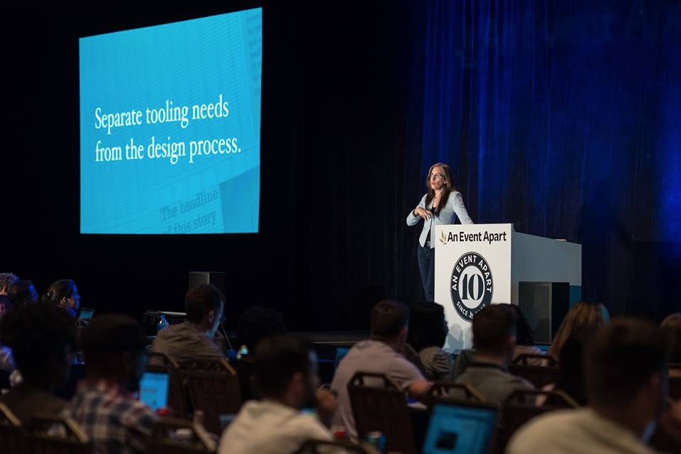
Jen Simmons speaking at An Event Apart Orlando 2016 at Disney’s Contemporary Resort in Walt Disney World on October 3, 2016.
We finally have the tools necessary to create amazing page designs on the web. Now we can art direct our layouts, leveraging the power and tradition of graphic design. In this eye-opening talk, Jen will explore concrete examples of an incredible range of new possibilities. She’ll walk through a step-by-step design process for figuring out how to create a layout as unique as your content. You’ll learn how Flexbox, Grid, Shapes, Multicolumn, Viewport Units, and more can be combined together to revolutionize how you approach the page —any
page.

Notes
- Art direction, Brand, Conversation
- Art direction
- Apple Watch — trying to fit with existing brands in the fashion world
- Editorial design
- “The vast majority of editorial [design] has at its heart the idea of communicating an idea of story through the organization and presentation of words (arranged into display and body text) and visuals.” — Cath Caldwell & Yolanda Zappaterra, Editorial Design, page 8
- Frameworks are making our layouts boring and predictable
- They were necessary at the time, but not now
- Layout shouldn’t be a multiple choice question
- Separate tooling needs from the design process
- Don’t make a framework out of CSS grid; CSS grid is a framework—built right into the browser
- Layout design
- Amazing future
- The Official Timeline of the Evolution of Web Page Layout
- The No-Layout Layout
- Table-based Layouts
- Hand-coded Float Layouts
- Framework Layouts
- Amazing Future!
- labs.jensimmons.com
- Little pieces
- Initial letter
p::first-letter { -webkit-initial-letter: 4; initial-letter: 4; }
- Feature queries
@supports (property: value) { }- “Using Feature Queries in CSS” By Jen Simmons
- Viewport units
- Anyplace you might use
em,rem,%,pxyou can instead use:vh: viewport heightvw: viewport widthvmin: smaller viewport numbervmax: larger viewport number
- Anyplace you might use
- Object fit
img { width: 50%; height: 400px; object-fit: cover; }
- Clip path
img { clip-path: polygon(0% 0%, 100% 3%, 98% 99%, 3% 93%); }
- CSS shapes
img { float: left; shape-outside: circle(); }img.grapes { float: left; shape-outside: polygon(nonzero, 72.35% 83.95%, 45.5% 94.3%, 0% 100%, 0% 88.4%, 0% 23.7%, 38.7% 11.35%, 55% 11.1%, 63.5% 22.7%, 72.15% 20.75%, 79.1% 30.6%, 79.8% 34.55%, 87.6% 43.95%, 83.7% 57.3%, 89.15% 65.7%, 92.55% 72.1%, 91.15% 83.2%); }- You can get polygon numbers by drawing around the image using CSS Shapes Editor extension in Chrome
- Initial letter
- Big pieces
- Flexbox
- Multicolumn
- CSS grid layout
- “A Complete Guide to Flexbox” by Chris Coyier
- Alignment
- Many ways to use CSS grid
- The Official Timeline of the Evolution of Web Page Layout
- When? Where? — CSS grid support
- Just works: Firefox Nightly, Firefox Dev Edition
- Behind flag (can be manually turned on): Chrome, Chrome Canary, Opera, Opera Developer, Firefox, Safari Technical Preview
- On its way: Edge, Safari
- IE10+ can use the old spec with
-ms-*prefix - Firefox CSS Grid Inspector add-on
- Process
- Organize content
- Create HTML file, set source order
- Sketch ideas for page layout
- Design a custom grid
- Apply CSS; write your own layout code
- How now?
- Progressive enhancement & the nature of CSS
- Not every browser needs to see these new features; the fallback looks just fine
- CSS grid currently doesn’t have very good browser support
- Being developed in current browsers behind flags
- 55-70% of browsers will have CSS grid support by spring 2017
- Progressive enhancement & the nature of CSS
- “Progressing Our Layouts” by Jen Simmons
- “Modern Layouts: Getting Out Of Our Ruts” by Jen Simmons
- Layout Land
Speaker Links and Resources
- Examples at labs.jensimmons.com
- Listen to thewebahead.net, especially episodes 115, 114, 81, & 9 for more on layout
- Video of Jen’s talk on how to use new CSS now, EnhanceConf – Jen Simmons – Progressing our layouts
- Video of Jen’s talk, Modern Layouts: Getting Out of Our Ruts
- “Deep Dive into Grid Layout Placement” — A blog post by Manuel Rego that gets into the implicit and explicit grid, hinting at just how complicated CSS Grid Layout gets
- Using Feature Queries in CSS
- Round specification
- Firefox Nightly
Related Links
- “A Redesign with CSS Shapes” by Chris Coyier
Video
Jen Simmons – The 2016 Design & Content Conference from The Republic of Quality on Vimeo.