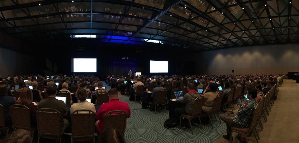
I was fortunate enough to attend An Event Apart in Orlando this month. I’ve posted my complete notes separately, but below you will find some of the key themes from the conference as well as an overview of each talk. You can also take a look at Articles, Links, and Tools From An Event Apart Orlando 2016 for more information and resources.
Key Themes
- Have empathy for the user
- Ask the right questions
- Performance is user experience
- Be consistent in branding
- Build style guides and pattern libraries
- The web doesn’t always mean a browser anymore
- Progressive enhancement
- Write clean, semantic code (including class names)
- Bootstrap is good for rapid prototyping, but bad for production websites
- We need to be more creative with design on the web (and better tools are on the way to help us)
- CSS grids are awesome
Talks
- “Designing With Web Standards in 2016” by Jeffrey Zeldman
- These are challenging times for web development, but it’s maybe not that much different than what we’ve already gone through
- Progressive enhancement is still the way to go
- Write clean, semantic markup
- “Practical Branding” by Sarah Parmenter
- Web design has become boring and predictable
- Focus on just a few of the highest priority parts of branding
- Consistency with branding elements produces brand equity
- “Designing for Performance” by Lara Hogan
- Performance is user experience
- Choose correct image format and optimize the image files
- Use web fonts sparingly
- Write clean, semantic code (including class names)
- Create a culture of performance
- “Style Guide Best Practices” by Brad Frost
- Style guides and pattern libraries reduce inconsistent experiences
- Blow up interfaces into a series of components (Atomic Design)
- Front-end development has to be a core part of the design process
- “Proper Etiquette for the Advancement of Design” by Dan Mall
- Ask the right questions and get all the right people together at the beginning of a project
- Your job isn’t just to make things look good
- “Revolutionize Your Page: Art Direction on the Web” by Jen Simmons
- Look to print design for inspiration in art direction on the web
- Better tools for art direction on the web will be here soon
- “Designing Meaningful Animation” by Val Head
- Great UI animation has purpose and style
- All the animations on your site should fit together
- Expressing your brand in motion
- Animation belongs in style guides and pattern libraries
- “CSS Grid Layout” by Rachel Andrew
- Things we use now for layout were never designed to be used for layout
- CSS grids are awesome
- “10 Things You Can and Should Do With SVG” by Chris Coyier
- Learn to reach for SVG
- SVG can be used to replace a lot of existing elements on our web pages
- “Extreme Design” by Derek Featherstone
- Cover extremes at both ends and you should cover most people in between
- Improving accessibility of a website actually leads to a better design in general
- Minimum viable interaction: The smallest amount of information and functionality needed to complete an interaction
- “The Art of the Sale” by Jaimee Newberry
- Communication builds foundation for understanding; understanding brings confidence; confidence establishes trust
- You can’t control others, but you can control yourself
- “The Physical Interface” by Josh Clark
- We’re forced to bend to technology instead of the reverse
- Our job as designers is to translate intent into action
- We’re going from digital to physical (and also from physical to digital)
- The goal is not to make things talk, it’s to improve the conversation
- Check the values of your creation
- “Resilience: Building a Robust Web That Lasts” by Jeremy Keith
- HTML and CSS are resilient; JavaScript is fragile
- Make core functionality available using the simplest technology (progressive enhancement)
- Accept the chaos of the web
- Developer convenience should not come at the expense of user needs
- “New Users Matter, Too! Designing Better Onboarding Experiences” by Krystal Higgins
- Good introductions are more like a conversation
- Remove barriers between the user and your product
- Onboarding can increase retention and engagement
- “Unified Design” by Cameron Moll
- The best interface is the one within reach — The best user experience assumes every interface is the one within reach
- We expect mobile version to have all the functionality of the desktop
- Craft unified, cohesive experiences regardless of where the experience begins, continues, and ends
- The goal is unity, not uniformity
- “Design Beyond Our Devices” by Ethan Marcotte
- We need to move from pages to patterns
- Design the priority, not the layout
- A well-crafted responsive design is device-agnostic
- Emphasize conditions and features, not devices
- If we design for the non-ideal, we will be in a much better position to succeed in the future
- Combine design patterns with design principles to create a design system
- “Compassionate Design” by Eric Meyer
- By planning for the worst we can actually be our best
- Don’t think edge case, think stress case
- Make a habit of being compassionate in what we do
- “Top Task Management: Making it Easier to Prioritize” by Gerry McGovern
- Our gut instinct is incredibly dangerous — We should not trust our gut instinct when designing websites
- If you ask a stupid question, people leave immediately
- Most web people are nibbled to death by tiny tasks
- You have to go broader than just looking at analytics