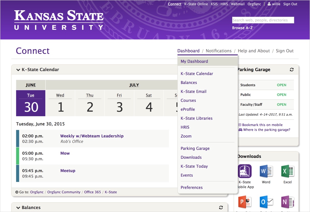
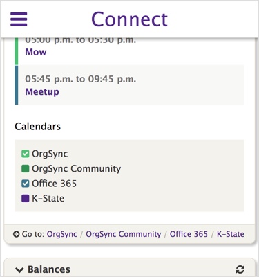
My team recently finished an overhaul of the navigation on our primary product, K-State Connect. Connect serves as a dashboard for Kansas State University, displaying various university services within “widgets”. The main goal of the navigation re-design was to add links directly to each of the widgets within the dashboard. The navigation was also in need of a better small screen experience.
Large Screens
For large screens, the sub-navigation for the dashboard appears when hovering over the “Dashboard” navigation item. This is done with pure CSS, no JavaScript required. If for some reason the sub-nav is not accessible, the menu item works just as a normal link, taking the user to the dashboard page when clicked/tapped.

If JavaScript is available, the nav bar will also stick to the top of the screen, allowing access to the menu at all times.

Small Screens
On small screens, the nav bar also sticks to the top of the screen when scrolling, just as it does on large screens.

When open, the navigation expands to the full height of the screen. Clicking/tapping a menu item with sub-navigation will open the sub-nav.

When JavaScript is not available, the main menu items are displayed at the top of the page and the sub-nav is hidden, leaving only the absolutely necessary items and making the navigation as small as possible.

Problems
Everything was going relatively smoothly with this project until we made the nav bar stick to the top of the page on small screens. We ran into two major problems, both with Safari in iOS.
Problem #1: Safari Scrolling
While the navigation is open, we wanted to prevent the page from being able to scroll in the background, but it turns out that Safari in iOS does not respect the overflow: hidden CSS property on the <body>. This caused quite a bit of odd behavior for the navigation menu in Safari, including not being able to access the bottom nav items at times because the background was scrolling rather than the menu.
I found several potential solutions to the Safari scrolling problem, but I could not get any of them to work reliably. In the end, making the navigation take up the full height of the screen seemed to help a lot. Safari will still scroll the background when scrolling up when the menu is already at the top or down when the menu is already at the bottom, but with the menu covering the entire screen, most users won’t notice.
One potential fix (or hack) for the scrolling problem was found in a Bootstrap GitHub issue where it was suggested to save the current scroll position in JavaScript when the menu is opened and set the <body> to position: fixed. This might be something that we try in the future.
Problem #2: Safari Controls
The other problem we ran into was with Safari’s controls at the bottom of the screen. When scrolling down, these controls disappear until the bottom part of the screen is tapped or the user starts scrolling toward the top of the page. The controls also overlay on top of the content. This means that any content at the bottom of the screen has no way of being tapped, the controls will always be in the way.
Jennifer Wong at Eventbrite has a good blog post highlighting the issues with the Safari controls. For us, the solution was to simply add a padding to the bottom of the menu to account for the height of the controls.
Conclusion
Overall, I’m happy with the way the navigation turned out. It’s a big improvement over what we had before. I was pretty surprised to see how many issues Safari in iOS presented, but they are good things to know about when designing navigation in the future. At some point I would like to try some other JavaScript solutions to prevent scrolling in Safari, but for now things seem to work pretty well.