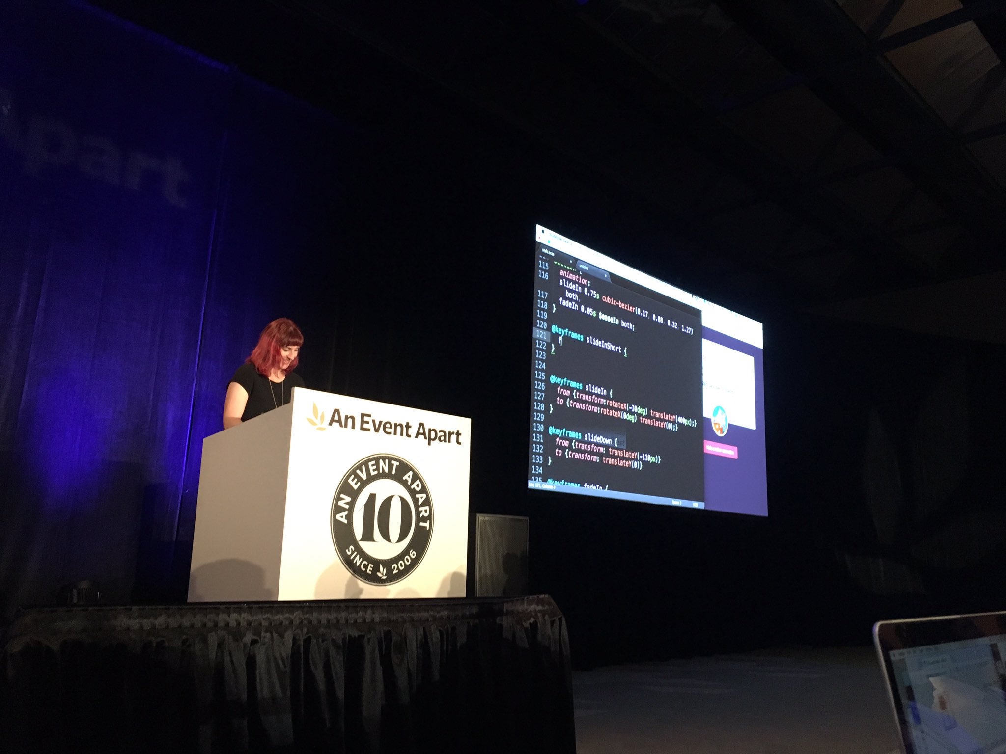
Val Head speaking at An Event Apart Orlando 2016 at Disney’s Contemporary Resort in Walt Disney World on October 4, 2016.
Motion design has become a necessary skill for designing and building the modern web. The character and energy that motion brings to an interface is becoming as expected on the web as it is in other media. Great web animation comes from thinking like a motion designer and brand steward, matching the motion we add to our message and design goals. Learn key animation principles such as timing, offsets, and secondary action as they apply to interface design decisions—plus motion principles specific to designing animated interactions. Consider this your crash course on becoming a motion design pro!

Notes
- Great UI animation has purpose and style
- Disney Animation: The Illusion of Life — 12 principles of animation:
- Squash and Stretch
- Anticipation
- Staging
- Straight Ahead Action and Pose to Pose
- Follow Through and Overlapping Action
- Slow In and Slow Out
- Arcs
- Secondary Action
- Timing
- Exaggeration
- Solid Drawing
- Appeal
- Animation Principle: Timing & Spacing
- Timing: The amount of time it takes for an action to happen; The duration
- Spacing: The changes in speed over the duration of the action’s timing
- Makes animated objects appear to obey the laws of physics
- Establishes mood, emotion and reaction
- Timing = duration
- Spacing = easing
- Only 5 keyword values for easing in CSS
- linear
- ease
- ease-in
- ease-out
- ease-in-out
- Use
cubic-bezierfor more controlcubic-bezier(x1,y1,x2,y2);- cubic-bezier.com — a tool to help select values
- Everything is better with cubic-beziers
- Questions to ask for timing and spacing:
- What sort of physical traits fit our modal?
- What sort of mood or emotion should it show?
- Animation Principle: Follow Through
- Not everything comes to a stop at once
- Overshooting the target position
- On cubic-bezier.com, choose curve that comes “out” of the graph area
- Animation Principle: Secondary Action
- Supplemental action, reinforces and adds dimension
- Example: Twitter “like” button
- Think about bigger picture
- All the animations on your site should fit together
- Choreography
- Designing all your UI animations to feel logical and related
- Look for a common thread for all the animations on a site
- Similar objects move/animate in similar ways
- Entrance informs exit
- Return item to where it came from unless you have a good reason to do something different
- Match velocities
- More of an art than a science
- Makes it feel like elements are more the same than matching durations does
- Cohesive over consistent
- Setting the exact same values for all animations on a site may not feel right
- Motion and Meaning — Episode 4: Playing Director with choreography
- Expressing your brand in motion
- What do you want to say?
- Match animation styles to voice and tone
- Use animation to project a certain message
- Design Adjectives — Energetic? Friendly? Sleek? Strong? Playful?
- Follow through & anticipation: Energetic, friendly, bold
- Squash and stretch: High energy and playful
- Ease-in-outs: Balanced and measured
- Smaller movements: Calm and subtle
- Opacity and blurs: Soft and stable
- Animation belongs in your style guide
- Document what animation is used for
- Document categories of animation
- Entrances and exits
- Give emphasis
- Give feedback
- Transitions between states
- Personality and brand
- Orientation
- Storytelling
- Document your building blocks
- Opacity
- Position
- Scale
- Rotation
- Colour
- Depth
- Aim to build your own animation library
- Be inspired!
- Book — Designing Interface Animation: Meaningful Motion for User Experience
- UI Animation Newsletter
Speaker Links and Resources
- “Researching Design Systems” by Dan Mall
- “How To Integrate Motion Design In The UX Workflow” by Mark Di Sciullo
- “Design Doesn’t Scale” by Stanley Wood
- Pixar storyboards