Jeffrey Zeldman speaking at An Event Apart Orlando 2016 at Disney’s Contemporary Resort in Walt Disney World on October 3, 2016.
Continue reading An Event Apart: “Designing With Web Standards in 2016”
Jeffrey Zeldman speaking at An Event Apart Orlando 2016 at Disney’s Contemporary Resort in Walt Disney World on October 3, 2016.
Continue reading An Event Apart: “Designing With Web Standards in 2016”
I’m slowly moving along on my first Drupal 8 project. After getting annoyed enough with the look of the login form, I decided to update my form templates to use Bootstrap 3 styles.
I recently had to reformat my Windows PC and do a fresh install of Windows 10. One of the primary uses for this PC is to run my home iTunes server, but soon after the reformat, it became clear that something was not right with iTunes.
Continue reading Windows Defender Does Not Play Nice With iTunes
It’s already getting to be a little late in the year, but here’s my quick roundup of the movies released in 2015 that I’ve been able to see so far. You can follow my movie-watching progress on Letterboxd.
My notes from CSS Dev Conf 2015 on The Queen Mary in Long Beach, California.
When did touch icons get so complicated? It had been a while since I last made a touch icon, so when I recently wanted to add one to a project, I decided I better double check the sizes of icons that I needed to make.
I remembered reading a useful article about touch icons in the past called “Everything you always wanted to know about touch icons”, which I was able to find again. I had thought there were only two sizes of icons that I needed, but I was surprised to find that the article had been updated with a recommendation to produce nine icons to account for various versions of iOS and Android.
In order to make this easier on myself (both now and in the future), I decided to make a handy Sketch template that I’ve linked to below. The final code needed in the HTML <head> should look like this:
<link rel="icon" sizes="192x192" href="touch-icon-192x192.png">
<link rel="apple-touch-icon-precomposed" sizes="180x180" href="apple-touch-icon-180x180-precomposed.png">
<link rel="apple-touch-icon-precomposed" sizes="152x152" href="apple-touch-icon-152x152-precomposed.png">
<link rel="apple-touch-icon-precomposed" sizes="144x144" href="apple-touch-icon-144x144-precomposed.png">
<link rel="apple-touch-icon-precomposed" sizes="120x120" href="apple-touch-icon-120x120-precomposed.png">
<link rel="apple-touch-icon-precomposed" sizes="114x114" href="apple-touch-icon-114x114-precomposed.png">
<link rel="apple-touch-icon-precomposed" sizes="76x76" href="apple-touch-icon-76x76-precomposed.png">
<link rel="apple-touch-icon-precomposed" sizes="72x72" href="apple-touch-icon-72x72-precomposed.png">
<link rel="apple-touch-icon-precomposed" href="apple-touch-icon-precomposed.png">
I attended An Event Apart in Orlando at the end of October, and I was able to re-visit the theme parks while I was there. I know this post is several months late, but I wrote down some thoughts about the theme parks that I wanted to go ahead and post.
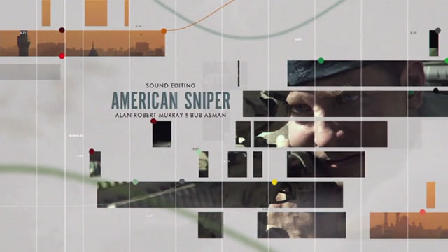
I loved the design of the 87th Academy Awards ceremony last night, and it looks like I wasn’t the only one. Bloomberg Business reported that the design work was done by Henry Hobson, a live action director and graphic designer. It turns out that I’ve seen some of his work before in a few other title sequences, such as the one from The Walking Dead.

I particularly loved the typography used throughout the Oscars. One other little detail I really liked was how the titles used for the best sound editing nominees looked like an audio timeline.
You can see more of Henry Hobson’s work by checking out his website or by following him on Twitter.
Update: Art of the Title has a much better writeup of the 87th Academy Awards, along with an interview with Henry Hobson.
A few weeks ago I ran across an article on The Verge titled “The best Gmail app for the iPhone is now made by Microsoft”. The article talks a lot about the new Microsoft Outlook app (a rebranding of the recently purchased Acompli app), but there was one quote that really stuck out to me:
…nobody wants to just give me an email client for my phone: everyone’s gunning to reinvent the entire experience and revolutionize the speed and efficiency of my communications.
That quote really summarizes my frustration with all these new e-mail apps. I don’t need someone to “reinvent” my e-mail experience. I don’t want to turn my e-mail into a to-do list. I just need someone to make an e-mail app that does e-mail well.
I did end up trying the new Outlook app for iPhone and still found it to be lacking in one major area: it seems to only be able to add one label per message, much like standard folders. The whole point of Gmail having labels instead of folders is so that messages can have multiple labels and thus can be found in multiple locations. Oh well, the search for a good e-mail app continues.
I recently decided to do a fresh install of OS X on my MacBook now that Yosemite is out, so I thought it would be a good time to post all the software I currently use. It turns out that I use a lot of apps. This list will probably be outdated within a month.